Matisse Capital
Design + Wordpress Implementation
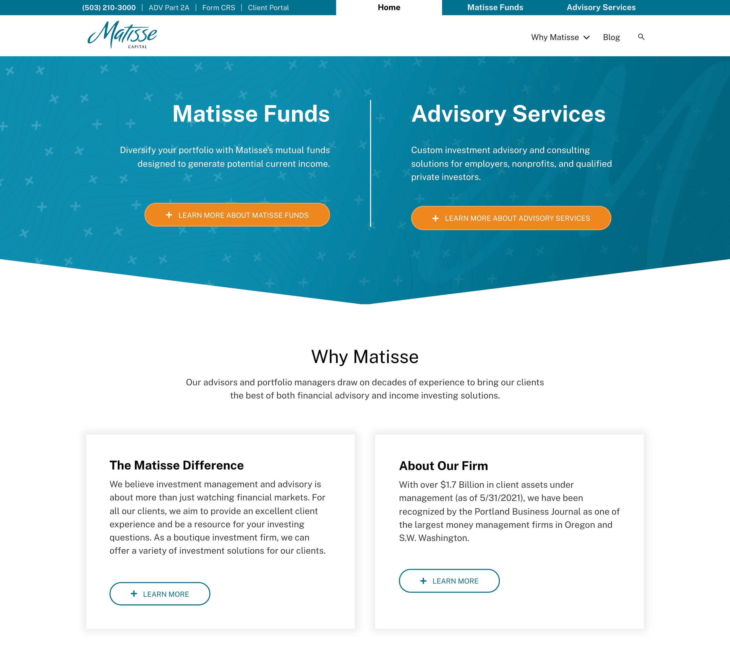
Matisse Capital needed a website that could showcase both sectors of their business—funds and advisory services—and give them a refreshed look. I joined another designer on this project to help with a few specific things. I designed the homepage layout, and then came up with some design elements to tie the site together. I also tackled some long content pages in an effort to make them more readable and interesting.
I started with a few mocks of the homepage, experimenting with different design ideas. I focused on utilizing the M in Matisse for its interesting curves and a plus sign. We weren’t allowed to use images of money in any form, so the plus sign is a discreet way to make the connection that this is a financial business.
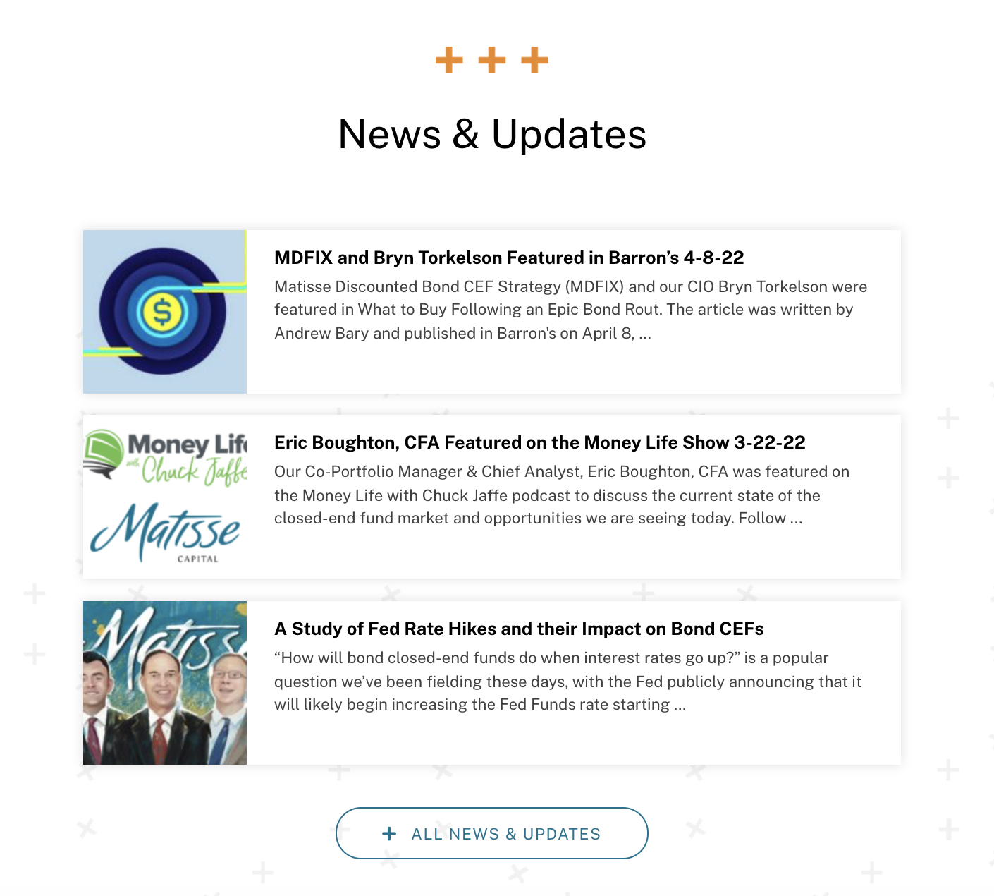
I did most of the creation and styling of global modules throughout the site (cards, blog posts, buttons, headers). This made it easy to make tweaks to the design of modules that appear on many pages.

