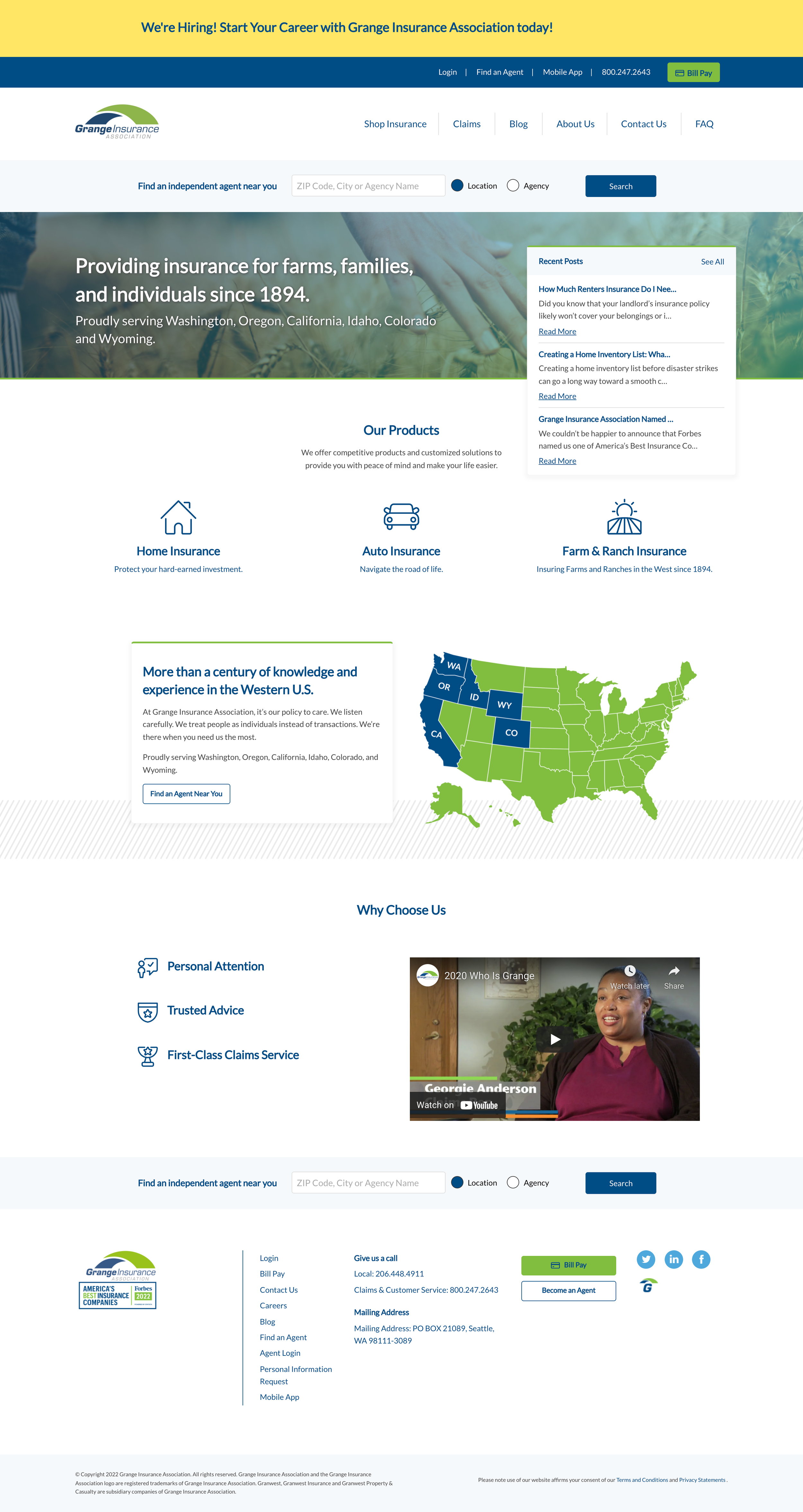
Grange Insurance Association
Design + Front-end development
This Pacific Northwest insurance company needed a fresh, updated website without losing the essence of their brand. I designed a homepage that took key elements from their old website in order to maintain some recognition for their client base.
The client wanted to include bios about their team without having separate pages for each, so I created a hover reveal with a slide up effect. This kept the page clean with the content easy to find.
This alternating block section was a key aspect of the site design. I coded the module so that every other row has a light blue background, the slanted lines overlay can be added easily, and the content flows sensibly into the mobile layout.
I designed the header with the intention of bringing more life to the pages with a subtle color overlay.
When I’m coding a site, I always start with the style guide, defining the brand colors, typography, buttons, and any styles that will create a cohesive site. Once this is done, I can build the modules that appear throughout the site, and then build out each page. And of course, making sure the content looks just as good on mobile as it does on desktop.


