LiftOne NOW
Design + Icons
LiftOne needed a way to maximize uptime for their customers’ heavy equipment. LiftOne NOW was designed for managing rentals and service requests, allowing material handling companies to view the status of repairs and request quotes without having to make a call. We were provided an initial set of mocks, which we tweaked and perfected through many iterations.
There are over 60 screens for LiftOne NOW, so I’ve included a few of the screens I worked on below with an explanation of my contributions.
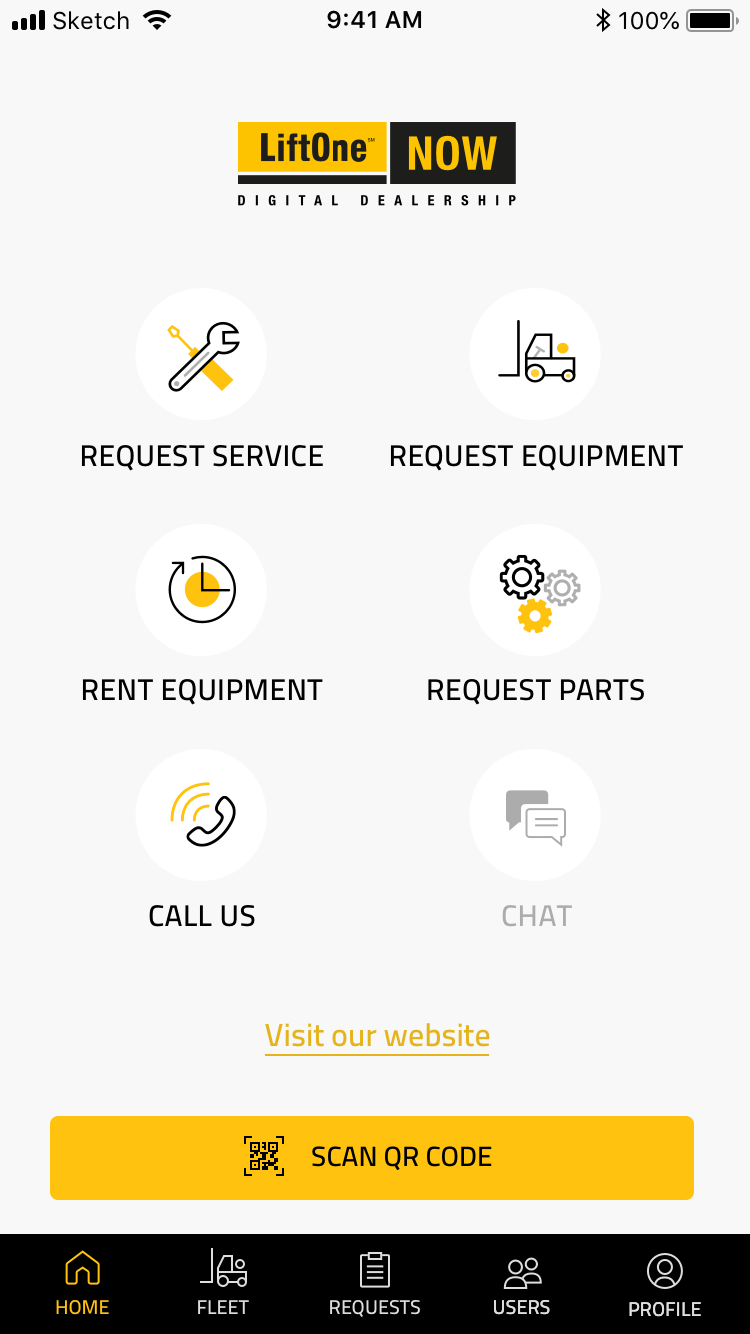
LiftOne NOW was passed off to me with approximately 20 screen designs already created in Illustrator. I transferred the screens to Sketch and created global styles with the brand colors and fonts.
I created all the icons on the Home screen to accompany the Request Equipment icon that was already designed. The Chat icon is greyed out to show that it’s unavailable, but is a feature coming soon.
After a few rounds of revisions, the client requested icons for each type of equipment. I designed an icon for aerial lifts, trailer spotters, railcar movers, and an other category.
I altered the design of this screen by adding a type of request icon, as well as status flags below each list item. I kept the icons grey here to keep the focus on the name of the equipment and the request status.
The blue status bar corresponds with the the status you see on the list of requests screen.
The grey icon you see below the blue bar is an example of one of the original icons that I redesigned to be simpler and easy to recognize on a small mobile screen.


